
Sehwan Park
Design lead at Etsy
ex- TikTok, DoorDash, eBay, SAP, Samsung
Career coach and mentor
Checkout 2.0
Problem & Scope
Etsy's checkout was hindered by unclear information hierarchy, outdated UI, and unintuitive interactions.
Constraint & Trade-offs
- Technical Constraint (Web-in-App Architecture) :
A web-based checkout limited native interaction patterns, requiring a balance between platform familiarity and cross-platform consistency. - Organizational & Legacy Constraint (Change Management) :
Legacy patterns and stakeholder risk aversion required balancing meaningful UX improvements with incremental change.
Design Decision & Direction
- Drive :
Defined a long-term path toward a native checkout architecture. - Deliver :
Improved the existing web-in-app experience within current constraints. - De-risk :
Used phased rollout to validate changes and minimize disruption.

Promo & Coupon
Problem & Scope
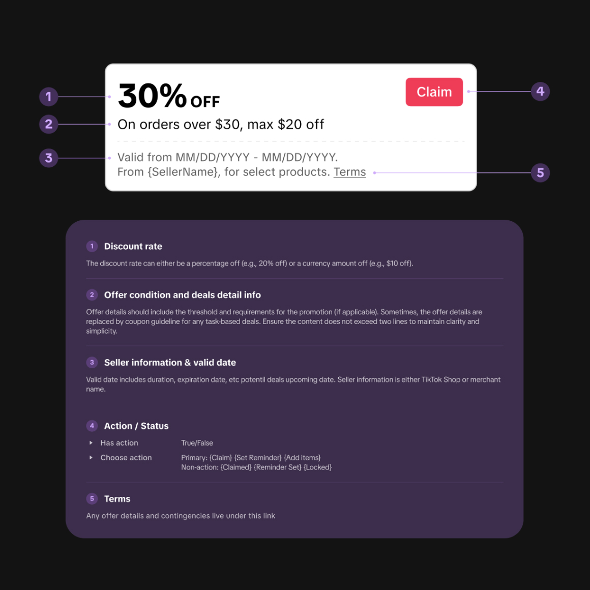
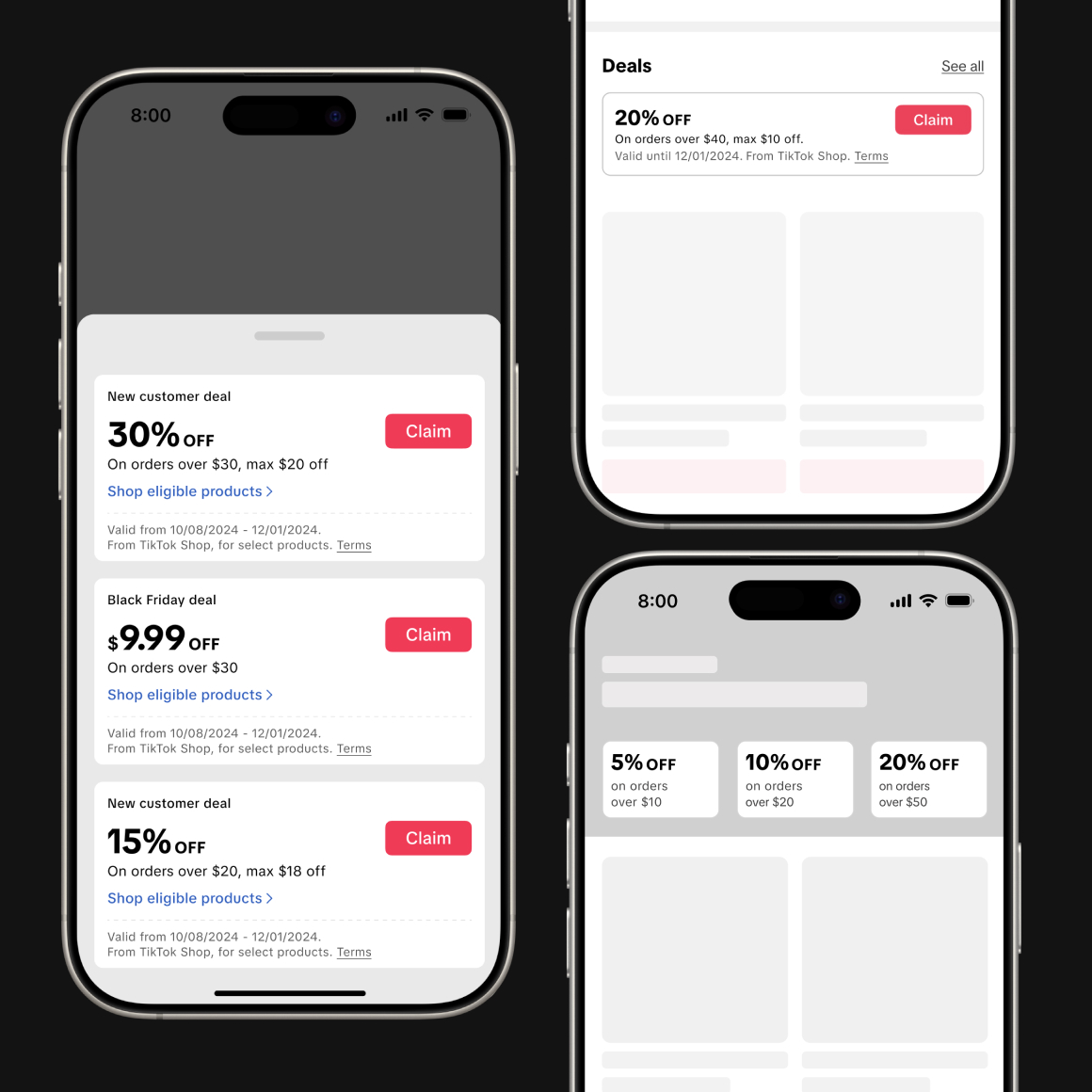
TikTok Shop's legacy coupon design was carried over from China without localization. Its UI patterns, built around Chinese shopping behaviors, didn't match US consumer expectations—creating friction and usability gaps.
Design Goals
- Clarity & Transparency :
Simplify complex promotion rules into intuitive, easily digestible visual patterns. - US-First Localization :
Replace legacy UI components with modern interaction patterns tailored to US shopping mental models. - System Consistency :
Establish a cohesive coupon design framework that seamlessly integrates across the entire TikTok Shop ecosystem.
Design Decision & Direction
- Phase 1: Fix the Foundations (Short-Term) :
Systematically resolved usability flaws and standardized UI components to establish a friction-free baseline aligned with industry standards. - Phase 2: Elevate the Experience (Long-Term) :
Reimagined coupons beyond simple discounts into a strategic engagement driver—crafting an end-to-end journey that reflects TikTok Shop's unique, content-driven identity.
DoorDash Reward Card Experience
Context & Opportunity
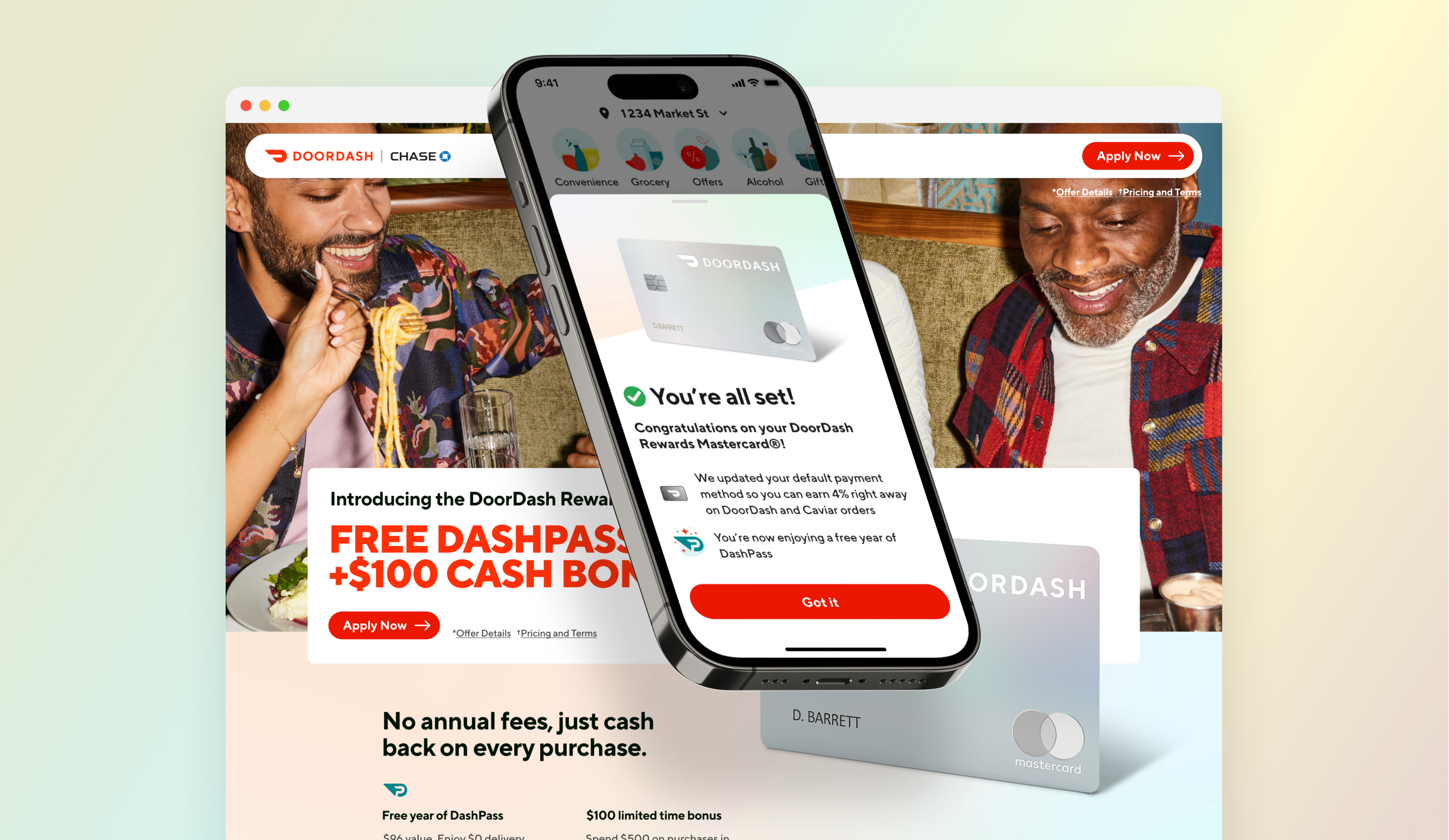
In 2022, DoorDash partnered with Chase to launch its first co-branded credit card. The initiative drove two core business objectives:
- Short-Term Acquisition :
Attract high-value new users through compelling cardholder benefits. - Long-Term Retention & LTV :
Build long-term loyalty and increase order frequency and basket size by delivering continuous value.
Scope & Leadership
As a Design Lead, I spearheaded this true 0-to-1 initiative from initial concept to final delivery—shaping the product vision, driving design strategy, and executing hands-on design. It included:
- Card application and instant onboarding flows
- Exclusive benefit concepts and reward ecosystem design
- In-app benefit surface and clear value discovery across the buyer journey
Make Offer
Problem
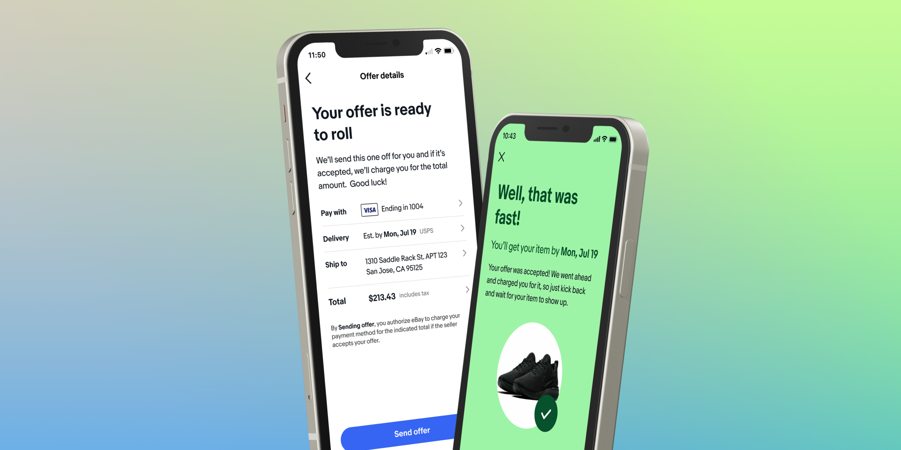
A key pain point in eBay's Make Offer flow was a high rate of Unpaid Items (UPI). Buyers often abandoned transactions after offer acceptance, locking up inventory from other shoppers. This post-acceptance drop-off drove significant seller friction and revenue loss across the marketplace.
Design Direction
“Build a streamlined checkout experience that empowers buyers to negotiate and seal better deals effortlessly.”
- Beyond Problem-Solving :
The goal was not merely to eliminate Unpaid Items (UPI), but to fundamentally reimagine Make Offer as a seamless, commitment-first purchase flow. - Frictionless Closing :
Transformed a passive post-acceptance wait state into an instant, high-intent checkout experience.
Order Detail Page
Highlights
I led the redesign of the Order Details page into a context-aware post-purchase experience. By restructuring the content hierarchy based on real-time fulfillment states and modernizing the visual aesthetics to align with our new design system, we made the overall experience significantly more frictionless and effortless for buyers.
Buy It Now
Problem & Opportunity
- No Distinct Value Proposition :
The legacy 'Buy It Now' experience offered no tangible UX advantage or friction reduction compared to the standard checkout flow. - Business Impact :
Without a clear speed or convenience benefit, user adoption remained low, resulting in significantly depressed conversion rates through the 'Buy It Now' entry point.
Design Direction
“Redefining 'Buy It Now' with a Distinct, High-Intent Value Proposition”
To differentiate 'Buy It Now' from standard checkout, we reimagined it as a specialized, low-friction entry point anchored on four key principles.
- Simple & Fast :
Streamlined steps to deliver instantaneous order completion for high-intent buyers. - Safe & Secured :
Reinforced security and buyer protection at every touchpoint to build checkout confidence. - Playful & Engaging :
Introduced delight and subtle micro-interactions to make fast-buying feel inherently rewarding.
Checkout with eBay
Highlights
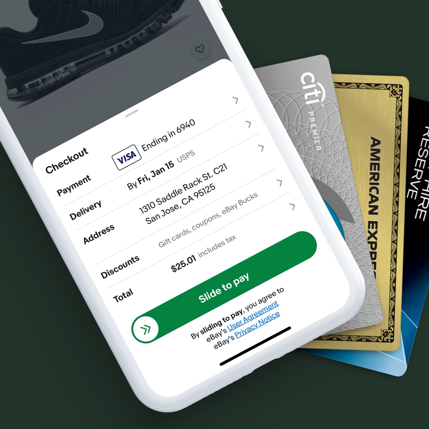
As Design Lead, I drove the design strategy for Checkout with eBay, aligning internal leadership and cross-functional teams with external European partner merchants. I led the UX creation of an embedded 3rd-party checkout flow, enabling seamless transactions using saved eBay credentials without sign-up friction.
SAP Fiori Design System

Highlights
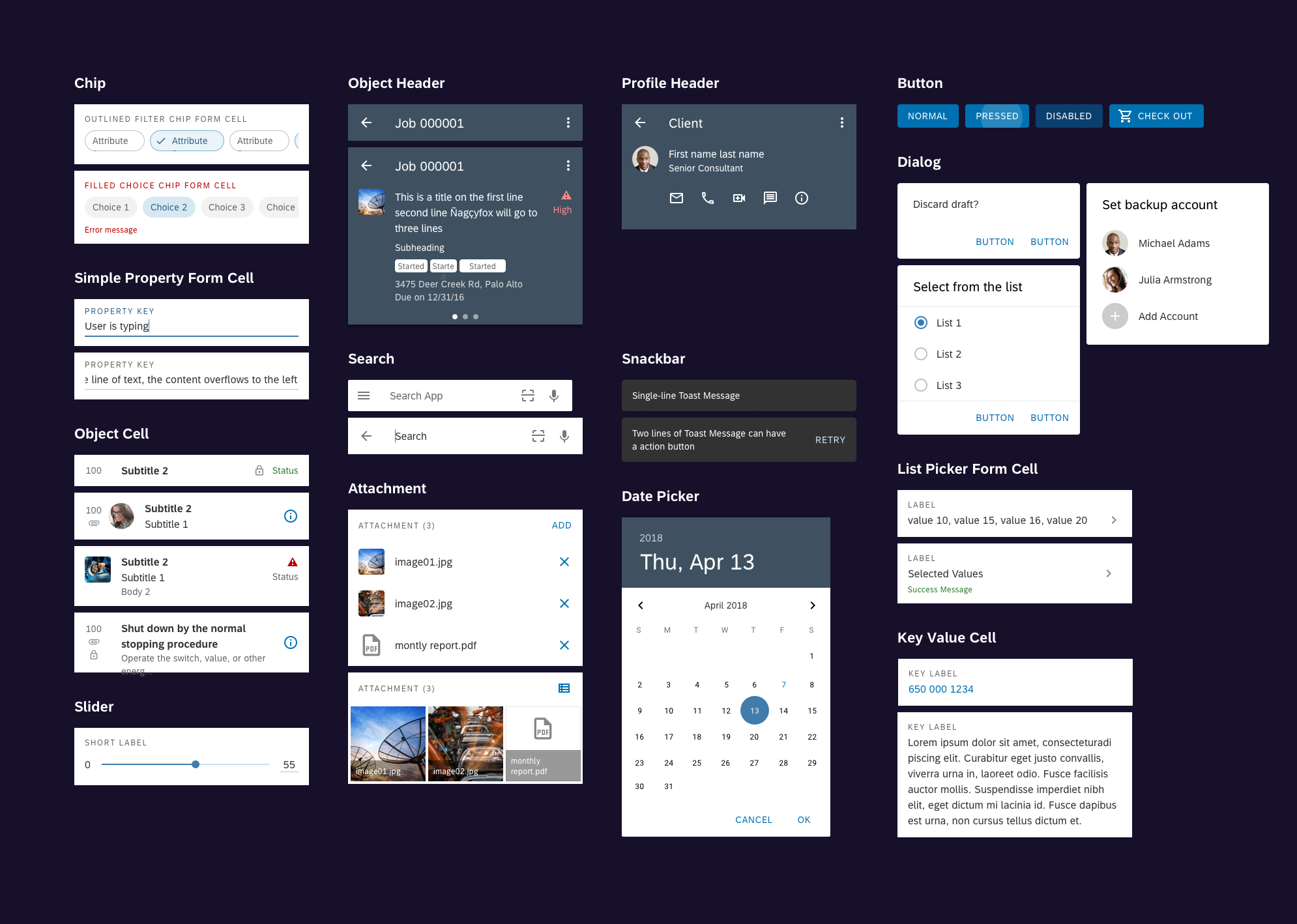
- 0-to-1 Design System Foundations :
Led the design system creation for native Android, establishing a scalable library of UI components and interaction patterns. - Enterprise Scalability :
Empowered client companies to efficiently solve complex operational challenges while seamlessly customizing to their visual and business needs. - B2B & B2C Impact :
Bridged deep business user insights with diverse contextual requirements across enterprise and consumer workflows.
and more -